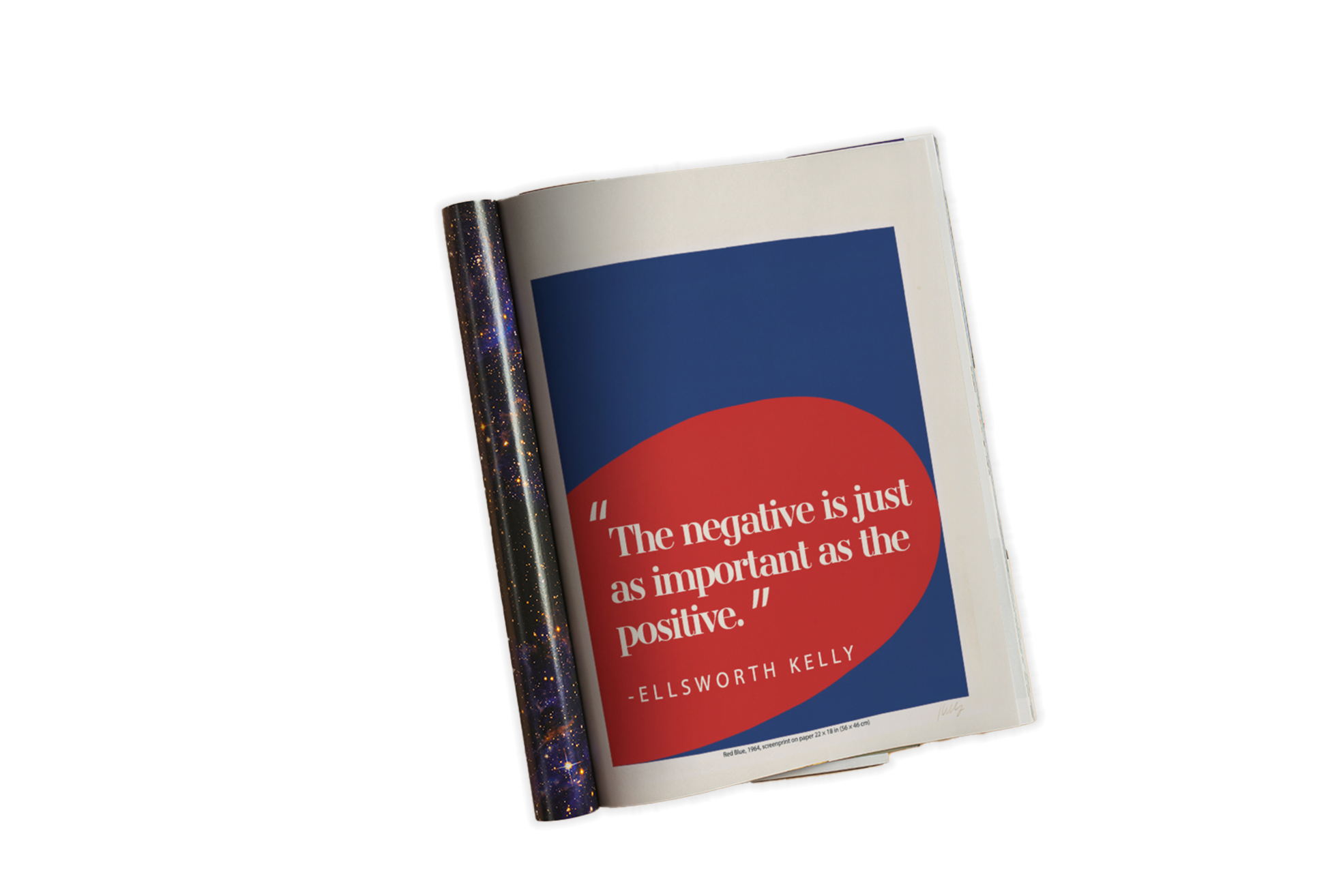
A dive into magazine layout design for Ellsworth Kelly; an established painter, sculptor and printmaker who was kmost known for his compositions of geometric shapes full of bright and strong colors.

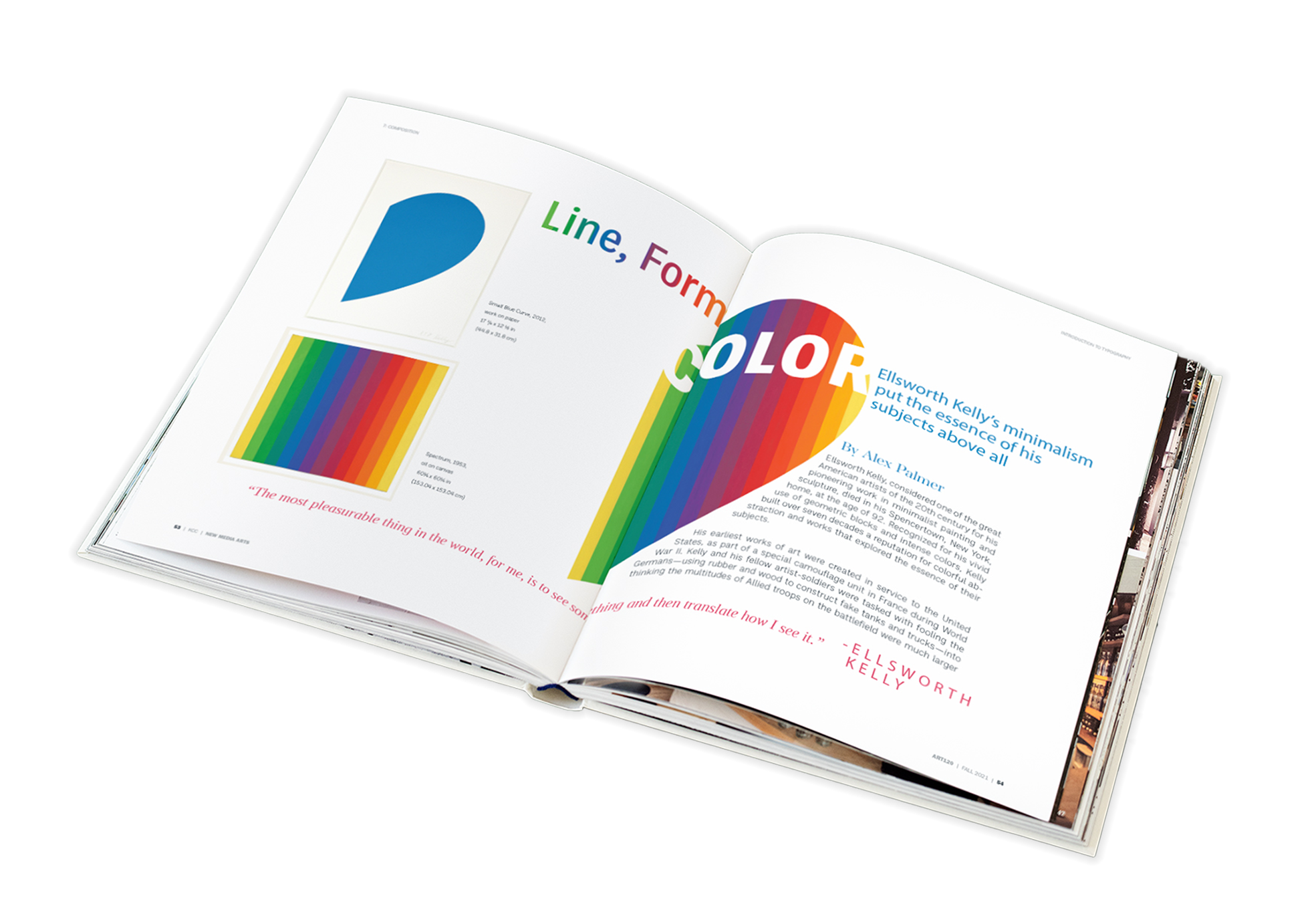
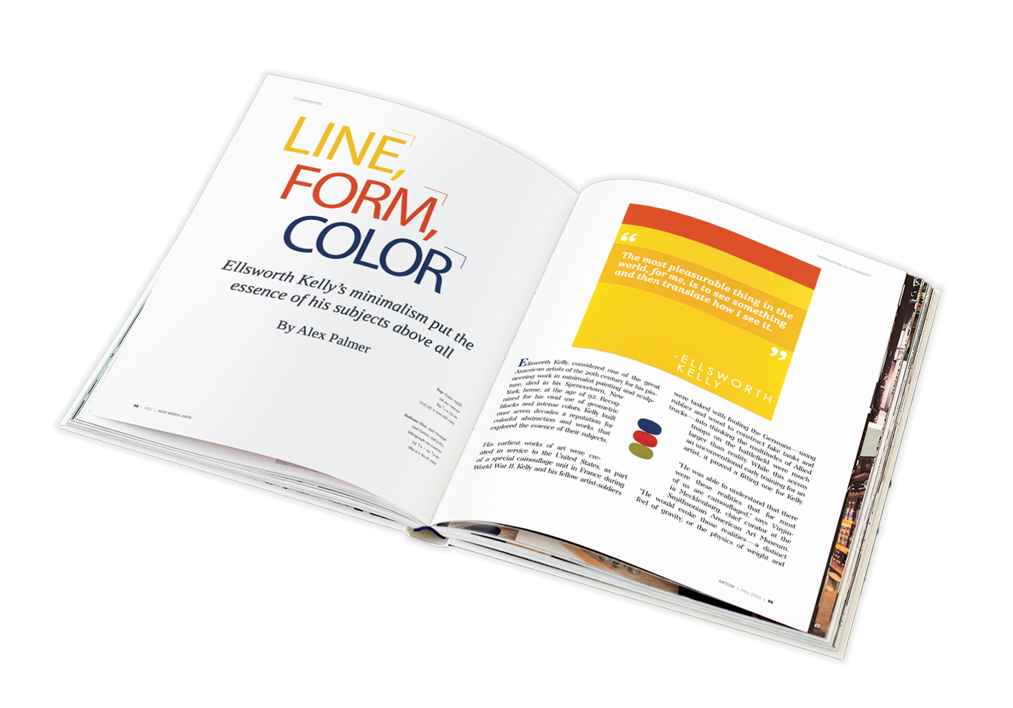
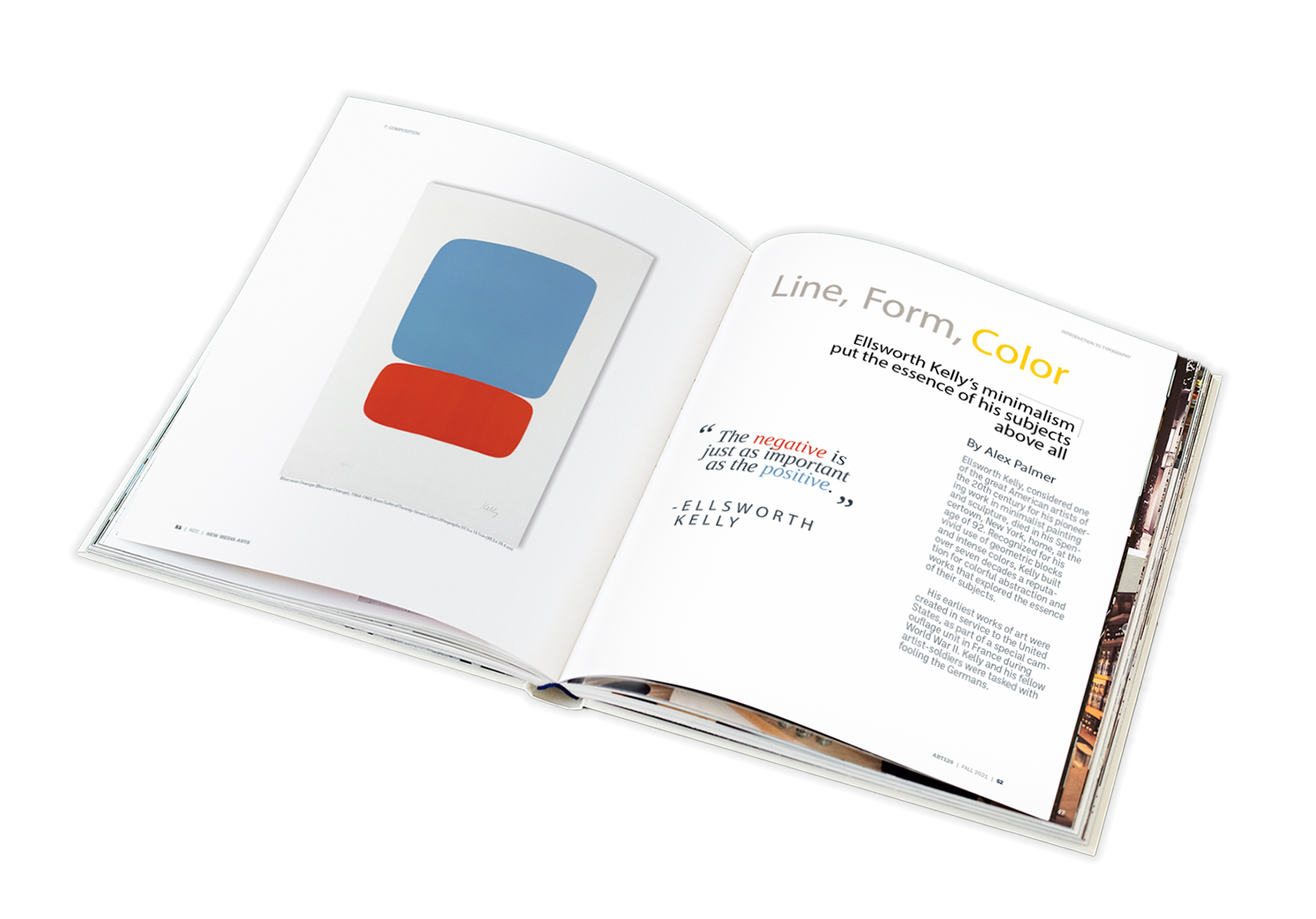
Maintaing a balance of type and whitespace on the page as well as using the correct fonts that compliments the artist's work.
I was able to finalize each page balancing the right amount of whitespace and the right choice of minimalist serif and sans-serif style tyefaces to go with the each art piece.